Article
Sep 10, 2026
Is 9:16 Coming to an End? How Apple’s iPhone Duo Could Change the Future of Mobile Media
Could foldable phones bring landscape video back to mobile? Explore how Apple’s iPhone Duo could reshape mobile media, UX design, content creation, and the future of digital experiences beyond the 9:16 vertical format.

For almost a decade, one format has dominated the way we consume content on our phones:
9:16.
Instagram Reels. TikTok. YouTube Shorts. Stories. Mobile advertising. Influencer content.
The rise of vertical video wasn’t simply a trend. It was a direct response to how people held and used their smartphones.
But Apple’s new iPhone Duo could challenge one of the most established assumptions in mobile media:
Mobile content doesn’t always have to be vertical.
With its foldable display, adaptive interface and larger unfolded canvas, the iPhone Duo could represent more than a new category of smartphone.
It could change how we watch, design and produce digital media.
And perhaps most interestingly, it could help bring landscape video back to the smartphone.
How Vertical Video Took Over
The smartphone fundamentally changed video consumption.
Traditional video was built around wide screens.
Televisions were landscape.
Cinema was landscape.
Desktop monitors were landscape.
YouTube was largely landscape.
Then smartphones became the primary device for consuming content.
But smartphones came with a limitation: they were narrow when held vertically.
Users naturally preferred holding their phones upright, especially when scrolling with one hand.
Content platforms quickly adapted.
Instagram introduced Stories.
TikTok built its entire experience around vertical video.
YouTube introduced Shorts.
Advertisers followed.
Creators followed.
Eventually, 9:16 became the default format for mobile content.
And it worked incredibly well.
Vertical video made content feel personal, immediate and immersive.
Faces became larger.
Captions became easier to read.
Creators could shoot with a phone.
And users could scroll endlessly with one hand.
But there was a trade-off.
We optimized the entire media ecosystem around the limitations of a rectangular smartphone.

Then Foldables Changed the Equation
Foldable phones introduce a fundamentally different relationship between the user and the screen.
Instead of having one fixed display, the device can change its physical form.
Apple’s iPhone Duo takes this idea further with a 7.6-inch unfolded display and an operating system designed to adapt to different orientations and layouts. Apple also positions landscape orientation as an immersive way to experience entertainment.
That creates an interesting question:
What happens when the smartphone is no longer a fixed canvas?
The answer could have significant implications for digital media.
Because when the screen gets wider, landscape content suddenly makes much more sense.
The Return of Landscape Video
Imagine opening an iPhone Duo to watch a movie.
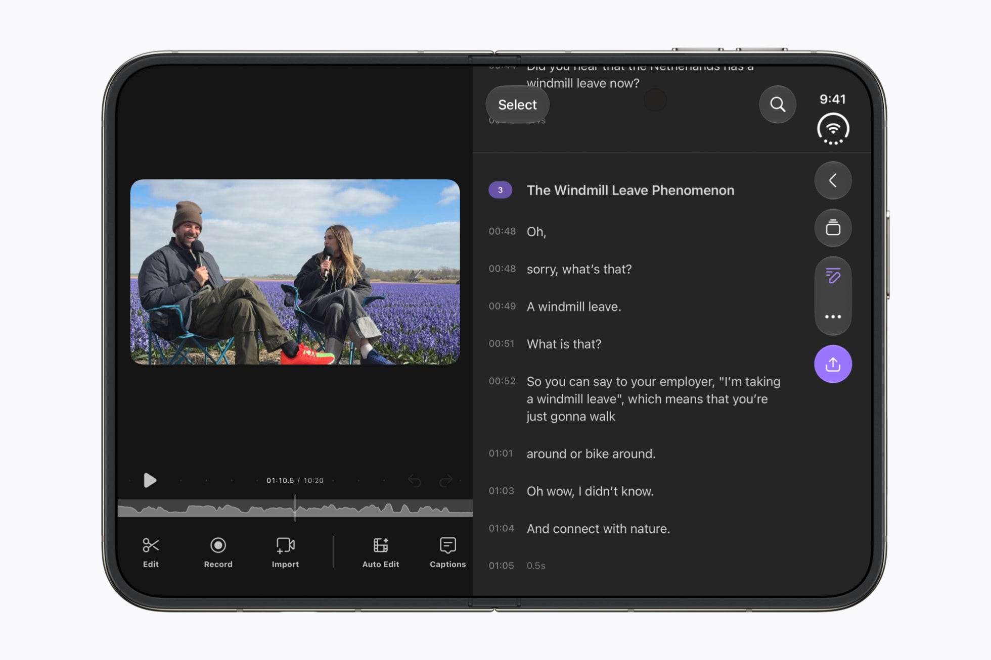
Instead of watching a widescreen movie squeezed into a vertical display, you can rotate the device and use a much larger horizontal canvas.
The same applies to:
YouTube videos
Sports broadcasts
Gaming
Travel films
Automotive content
Documentaries
Product demonstrations
Brand films
Live events
These formats were never naturally vertical.
We simply adapted them because smartphones were.
Foldables could remove some of that limitation.
And that could lead to an interesting new media behaviour:
Vertical for discovery.
Horizontal for immersion.
The two formats don’t necessarily have to compete.
They can serve different purposes.
The Phone Could Become a Dynamic Media Canvas
This is where the change becomes more interesting from a UX perspective.
Today, designers typically think about responsive design in terms of screen sizes:
Desktop → Tablet → Mobile
Then we consider:
Landscape → Portrait
Foldable devices introduce another dimension:
What is the user doing with the device?
Are they scrolling?
Watching?
Reading?
Gaming?
Working?
Video calling?
Editing?
The physical state of the device can now influence the experience.
Closed phone.
Open phone.
Portrait.
Landscape.
Partially folded.
Different states can support different activities.
Apple’s adaptive iOS 27 experience points toward this future, where applications can take advantage of the larger unfolded display and different orientations rather than simply scaling a conventional mobile interface.
This is a significant shift in how we think about responsive experiences.
From Responsive Design to Adaptive Experiences
For years, responsive design meant making the same interface work across different screen sizes.
But foldables introduce something more dynamic.
The device itself can change.
And therefore, the experience can change with it.
Imagine a travel application.
When closed:
You browse destinations vertically.
When opened:
The interface expands into a richer travel-planning experience.
The map occupies one side.
The itinerary occupies another.
Videos can play in a wider format.
Images have more room.
Recommendations remain visible while you explore.
The application isn’t simply getting bigger.
It is becoming more useful because the canvas has changed.
That’s the real opportunity.
What Does This Mean for Content Creators?
This could eventually force creators to rethink the traditional 9:16-first production model.
For years, a typical content workflow has looked something like this:
Shoot → Edit → Export 9:16 → Publish
But a future with more foldable devices could require something different.
Creators may increasingly need to think about multiple native experiences:
9:16 — Social scrolling and discovery
16:9 — Immersive viewing
Adaptive layouts — Foldable and tablet experiences
The question won’t simply be:
“Which aspect ratio should we use?”
It will become:
“How should the story behave across different canvases?”
That’s a much more interesting creative challenge.
Brands Will Have to Rethink Mobile Advertising
The implications could be particularly significant for brands.
Today, many mobile advertising campaigns are built almost entirely around vertical formats.
A travel company might produce a 15-second vertical Reel.
An automotive brand might create a vertical product video.
A hotel might create a vertical property tour.
But imagine viewing those experiences on a large unfolded phone.
Suddenly, the additional horizontal space becomes valuable.
A destination campaign can show the entire landscape.
A car advertisement can show the vehicle in its environment.
A luxury hotel can showcase its architecture.
A real-estate walkthrough can provide a wider view of the property.
The creative doesn’t have to fight against the dimensions of the screen.
The screen can finally work with the creative.
Travel Could Be One of the Biggest Beneficiaries
Travel content is particularly interesting because destinations are inherently visual.
Think about a beach.
A mountain range.
A city skyline.
A safari.
A resort.
A road trip.
A cruise ship.
These experiences often benefit from wide compositions.
For years, travel brands have had to crop beautiful landscape imagery into vertical formats because that’s where the audience is.
Foldable devices could introduce another opportunity.
A travel brand could potentially create:
Vertical content for discovery.
Landscape content for inspiration.
Interactive unfolded experiences for planning.
Instead of simply showing users a destination, the device could become a small window into that destination.
This could eventually blur the boundary between content consumption and digital experience.
Social Platforms May Have to Adapt
The next challenge will be for platforms.
Social networks have spent years optimizing their interfaces around vertical feeds.
But if foldable phones become mainstream, platforms could increasingly need to support multiple screen states.
Imagine a social platform that understands:
Closed → vertical feed
Open portrait → expanded feed
Open landscape → immersive video
Split screen → content + conversation
This could create a new generation of interfaces that aren’t simply responsive.
They are context-aware.
The interface understands the device.
It understands the user’s activity.
And potentially, it understands what type of content is being consumed.
The End of 9:16?
Probably not.
Vertical video isn’t going anywhere.
The behaviour that made it successful is still incredibly powerful.
People will continue scrolling through Reels.
They will continue watching Shorts.
Creators will continue producing vertical content.
But the more interesting possibility is that 9:16 may stop being the default answer for everything.
For years, mobile design had one dominant canvas.
Foldables introduce multiple canvases.
That means the future may not be:
Vertical vs. Horizontal.
It could be:
Vertical + Horizontal + Adaptive.
Each format serving a different purpose.
From “Mobile-First” to “Canvas-First”
This may ultimately be the biggest design shift.
We’ve spent years talking about:
Mobile-first design.
The philosophy made sense when mobile was a smaller version of the desktop experience.
But foldables challenge that idea.
The device itself is no longer fixed.
The screen can expand.
The orientation can change.
The interface can reorganize.
The content can respond.
So perhaps the next generation of digital experiences won’t be designed around a specific device size.
They’ll be designed around the canvas and the context.
Instead of asking:
“How do we design for mobile?”
We may start asking:
“What is the best experience for this canvas, in this state, for this activity?”
That’s a much more powerful design question.
The Bigger Picture
The iPhone Duo isn’t going to suddenly make every creator abandon vertical video.
But it could start a much more subtle transformation.
The smartphone that once forced us into vertical media may now become a device that supports multiple native media formats.
And that could influence:
How creators shoot video
How editors produce content
How brands develop campaigns
How advertisers design creatives
How social platforms structure feeds
How UX designers approach responsive design
How developers build adaptive interfaces
The interesting irony is that the smartphone helped create the vertical-video revolution.
And the next generation of smartphones could help bring landscape media back.
Not as a replacement for vertical.
But as another native way of experiencing content.
The Future Isn’t Vertical or Horizontal
It is adaptive.
The biggest innovation in foldable phones may not actually be the hinge, the thinner body or even the larger screen.
It may be what happens when designers realize that the screen no longer has to have one permanent shape.
When the canvas changes, the experience changes.
When the experience changes, content changes.
And when content changes, the way we tell stories changes with it.
At XVOXLABS, we believe the next generation of digital experiences will be built around this intersection of human behaviour, design and technology.
Because the future of digital isn’t just about making screens bigger.
It’s about making experiences smarter.
And perhaps the next chapter of mobile media starts with something surprisingly simple:
Unfold the phone.
Turn it sideways.
And watch the landscape come back.
What This Means for Designers and Content Teams
If foldables continue to grow, businesses should start thinking beyond a single aspect ratio.
Design for the experience, not just the screen.
Consider:
Creating content systems that support multiple aspect ratios
Designing adaptive layouts rather than simply responsive ones
Planning video compositions that can crop intelligently
Building campaigns with both discovery and immersive viewing in mind
Testing experiences across foldable, tablet and conventional devices
Treating device orientation as part of the user experience
The next competitive advantage may not belong to brands that create the most content.
It may belong to brands that create content that adapts intelligently to how people consume it.